

This is my main image i wanted to use for the double page spread, so i started by editing the photo by brightening and also slightly increasing the contrast and using the red eye removal tool. As i wanted the photo to be in the bottom right hand corner i also flipped the photo so she was facing the other way. To keep with the colour scheme for my magazine i wanted to stick to have a white plain background to keep the page simple so i used the magic wand tool to cut out the background of the photo and this proved to be difficult as she blended in to much with the wall and floor so the parts the magic wand tool couldn't pick out i used the rubber tool and this didn't give it the cleanest finish i had hoped for as it was very hard to distinguish between her body and the background. After the background was erased i used the magnetic lassoo tool to cut her out and then copied and pasted her onto the blank a4 page i had created.

After I had copied and pasted her onto the blank a4 page I moved the image to where I wanted it: in the bottom right hand corner. I chose this image as it lines up with the bottom of the page and looks like she is lying across the bottom and leaning. I then used the text tool to write the page number in arial just a simple font and also wrote the website. I placed this on the bottom left hand corner of the page and then another text box for the page number of the other page and as I couldnt put it right in the corner as her hand was in the way i just placed the number beside it. Then using the rectangle tool i created a small rectangle and made it pink to go with my colour scheme. Then using the text tool wrote exclusive interview in the same font that i have used and will use throughout my magazine. I also wrote it in capital letters to stand out more and have more of an effect. I was going to write new beat in the same font but i have noticed that a convention of magazines is to use the same font of the title throughout the magazine when mentioning it. So as my title is saved as a jpeg image i copied and then pasted it onto the double page spread and made it smaller so it matched the same size as the text 'Exclusive interview'.

The next step was i added the title each word in different text boxes so they were different layers and so i was able to move and position them how i wanted them. I used the same font i used on the front cover and also the same colours, this time instead of alternating colours for each word i alternated between black and pink on each line. And then positioned it how i wanted it. Underneath the title i wrote a few sentences summarising the interview. This text will be slightly larger then the interview text so it stands out more. I also used black text as the text above is pink so its more eye catching to be black and also so it fits in with the colour scheme. Whilst looking at real examples of double page spreads and interview i noticed that in this section when mentioning the artist talking to the magazine when they write the name of the magazine they use them same font as the front cover and as i have already used that in the top right corner i thought it would fit well again and i have also noticed it is a convention. I copied and pasted the text and made it smaller to be the same size as the normal font. In the space beside the model on the right side i added a picture of her 'sister' Pixie Lott. To give the picture more of a finished look for a magazine and to match my colour scheme i added a small pink border around the picture. To do this i went on resize, canvas size and added approx. 0.5 cm around it and changed the colour to pink. This gave the photo a thin pink border and i then copied and pasted it onto the double page spread and resized to fit where i wanted to place it. Underneath the photo i added a little caption a convention of magazines i have looked and used the font arial.

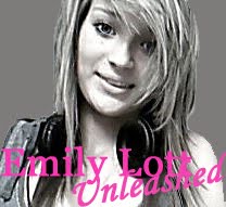
Another convention i have come across is when having a interview in a magazine the artist usually promotes their new album/single coming out and there is normally a picture of it and the date. I used this picture of my model as she has headphones on and i liked the look of it for an album cover. To create the album cover i first started by zooming in as i wanted a close up, i then cropped the image so there was so unecessary background. To get rid of the background i used the rubber and changed the colour to grey. I then added the text Emily Lott in font georgia and unleashed underneath diagonally in font lucida handwriting.

The next step was adding the smaller photo's from the photoshoot i chose my 2 favourite photo's and edited both by cropping them so there was not too much background and increased the brightness and contrast to give the photo's more of a summery feel as the photo's were taking in the sunshine on the grass. I then added a pink border so they would match the photo of Pixie i done this the same way by slightly increasing the canvas size. I also changed the picture of Pixie as i remembered that my cousin had pictures of her when she went to one of her gigs so i changed the picture for one of them i also edited the photo by increasing brightness and contrast. And added the border again.

Next it was time to add the main text. The double page spread was going to be an interview between the magazine and a Emily Lott. I looked through a few magazine interviews to give me an insight on some questions i could ask. I thought of a number of questions then started to add the text i used separate text boxes for the question and the answer. I was going to alternate the text from black to pink but as i had done that for the title i though it might be a bit too much and overwhelm the reader. So i did all text black but for the question made it bold so there was a slight difference. I moved all the text boxes so they were in line with the title and then had the same amount of space between each column. I then added a quote in a larger size font but still arial over the picture of 'Emily'. Underneath the album cover i added text in arial and italic and in pink so it stood out against all the black text.

When i looked at my final piece i realised i had forgot to use a centre line so there was no text covering it so i used the rectangle tool to create a thin line for the middle of the page so i knew where to move things around. I had to edit all the interview text take some parts out as there was too much to put into two columns and decreased the size of each separate text box, eventually i moved it all around so there was space left for the centre line then i took out the rectangle i drew in the middle. I later when on to add speech marks to the quote.
No comments:
Post a Comment