
1. In what way does your media product use, develop or challenge forms and conventions of real media products?
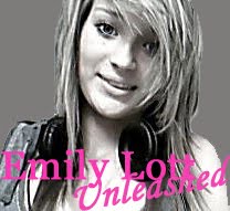
At the beginning of the coursework where I analysed music magazines that really helped me get ideas and help to create my magazine. It made me understand the conventions of music magazines and how I could use them in my own and challenge them in some ways. Conventions are things like pugs, coverlines, colour schemes, where to place the masthead and where to place the barcode..While designing my front cover I was reffering to an issue of blender. The similarites between blender and my magazine are I used the colour scheme pink, white and and also used left to right column alignment. I positioned my model in the middle of the page aswell. Another similarity is Katy Perry's head is covering a big part of the title and I wanted to incorporate that in mine however didnt want to much of the text to be hidden to I arranged the image layer to the front so it is only slightly covering part of the 'W'. For the smaller coverlines Blender use a + sign instead of using the word I though this was a good idea and as I am using informal text for my target audience it thought this would be a great idea, one slight change i made was to make the + considerably bolder and bigger. For my main coverline I used the way blender did and alternated between black and pink for first and last name.
At the beginning of the coursework where I analysed music magazines that really helped me get ideas and help to create my magazine. It made me understand the conventions of music magazines and how I could use them in my own and challenge them in some ways. Conventions are things like pugs, coverlines, colour schemes, where to place the masthead and where to place the barcode..While designing my front cover I was reffering to an issue of blender. The similarites between blender and my magazine are I used the colour scheme pink, white and and also used left to right column alignment. I positioned my model in the middle of the page aswell. Another similarity is Katy Perry's head is covering a big part of the title and I wanted to incorporate that in mine however didnt want to much of the text to be hidden to I arranged the image layer to the front so it is only slightly covering part of the 'W'. For the smaller coverlines Blender use a + sign instead of using the word I though this was a good idea and as I am using informal text for my target audience it thought this would be a great idea, one slight change i made was to make the + considerably bolder and bigger. For my main coverline I used the way blender did and alternated between black and pink for first and last name.


At the beginning of the coursework i analysed Q front cover this gave me some inspiration for my own so I used some of the conventions they used. Like Q did, I put a banner at the top of my page they did it so the readers know they are reading a magazine of high standards so thats what i wanted for mine. However mine says ' Britains best-selling pop magazine' I made it more specific to a genre rather then just music in general. I also used the idea of using a pun in the main coverline. Q used a pun on Cheryl Cole's album so thats what I did for my main coverline. I used a pun on 'Emily Lott's' album called unleashed so my main coverline is Emily Lott Unleashed. I challenged conventions by not using a pug like many magazines do such as Q for example, this reason I did this was i wanted a simple and sophisticated front cover and I thought a pug wouldnt suit it therefore I did not create one.

When creating my contents page I used conventions and also tried to challenge them. I got my first inspiration from NME contents page as they don't use the word 'contents' which I did not want to use either as it sounds to formal and my magazine is informal. I decided I wanted my magazine to be weekly so I used the idea that NME uses however slightly changed it by using a '!' and a thinner line underneath as i didnt want it to look to bulky, so I added the date and issue number underneath the line.


Whilst analysing double page spreads i noticed that interveiws with an artist most have exclusive interview wrote somewhere on the page and as my magazine there is an interview with a new artist I felt it would be good to include that so the readers feel that they are special getting to read it. I placed this text on the right side of the page in the top corner so when flicking through the magazine the reader will see it. As the double page spread consisted of an interview another convention i came across was to use a quote from it and make it larger to stand out from the rest of the page, i included this in mine to make it look like a real interview.


I have used conventions so it really attracts and suits my target audience, I did not want to challenge conventions to much as i thought it would put my target audience off buying my magazine.
2. How does your media product represent particular social groups?
I have used a number of different elements to represent a particular social group, such as clothing, language, colour, font etc. I am aiming my magazine at teenage girls and am representing them through my magazine. The first thing that represents teenage girls is the colour pink that I used throughout my magazine. On the front cover I also used a model that my audience can aspire to wearing clothes that are fashionable and affordable I wanted a positive veiw on an artist that can be their role model. Teenage girls can associate with Pixie Lott and she is admired so choosing to do a story on her 'younger sister' I thought would attract my target audience. I used a girl to model from the same age range that i am targeting my magazine at so they can associate with her. I did not use any adults in my magazine or anyone a lot younger as this would not target my audience. I am also aware that throughout my magazine I did not use any one of a different race which if I did this task again I would include. I think that pop magazines, especially the ones I looked through mainly use white people for their photos. Black people are mainly/ stereotypically associated with r'n'b and hip hop magazines. To improve my magazine I could of included pictures of people from different races.

3. What kind of media institution might distribute your media product and why?
One company that might publish my magazine could be IPC media: http://www.ipcmedia.com/, they have published 80 successful magazines including NME. They also reach almost two thirds of women and my magazine is aimed at girls. They produce a range of magazine each diverse, although do not publish a pop magazine so therefore them publishing my pop magazine would give them more scope.
Another company that might publish my magazine is Hachette Fillipachi UK Ltd. Britain's most newest and exciting magazine publishing house. They have published magazines such as Elle, Red and Sugar. Sugar is a British magazine for teenage girls. Its content focuses on boys, fashion, celebrities, real-life stories about teenagers and other similar matters. That is who i am aiming my magazine at and i think that they would publish my magazine as it is focusing on a different aspect of their target audience. They do not publish a music magazine so this would help them offer a wider range of magazines. http://www.hf-uk.com/
My magazine could be sold and distributed in well known places such as Tescos and WHsmiths this will help to sell my magazines and these places are easy accessable to everyone and very well known. My magazine could also be distributed by mail subscription this would be easier my target audience as they could subscribe to my magazine and get their copy of it each week delivered to them so they dont have to leave and go to the shop and buy it. Magazines are also sold at kiosks in smaller news agents this might be a good way to sell my magazine as my target audience might be attracted by this and whilst buying whatever in the shop might see my magazine and pick it up.
4. Who would be the audience for your media product?
The audience for my media product is teenage girls, someone like Lily who i did for my audience profile. Like Lily, they should be interested in fashion and music and anything girly! Some of their favourite artists should include: Katy Perry, Pixie Lott, Emily dares you etc. Without this taste in music and hobbies there would not be much point in buying my magazines so therefore my target audience who are interested in these things this magazine will really suit them. My audience profile of Lily is the typical person i think to read my magazine i also think my model i chose is the perfect look for a pop magazine. As i am aiming my magazine at teenagers they are mostly all students which means they have a low income so i priced my magazine at £3 so it is affordable for them.

5. How did you attract/adress your audience?
Mise-en-scene is also important to magazines to help attract an audience. I attracted my audience by a number of different techniques. I used images of a model that i thought represented my target market of teenage girls. The model i used - Vicky as 'Emily Lott' is blonde, slim build and very pretty this will attract girls to my magazine and also can aspire to her. I dressed her fashionably and also in the style of Pixie Lott like a copy image. Teenage girls aspire to Pixie Lott so this look should work. They are both wearing similar clothes i also decided to add a black flower to match the colour scheme and they are in fashion lately and and affordable trend for all teenagers.


I chose the colour scheme of white, black and pink as it looks simple yet girly, which will draw my target audience in. The language i used throughout my magazine was inoformal which will be easier and more fun for my audience to read. I included a Date competition in my magazine which i think will attract my teenage audience i also chose to use Justin Bieber as he is very popular at the moment.

By making the magazine cheap at only £3 this ill also attract my target audience.
6. What have you learnt from the process from constructing this product?
To create my music magazine i used photoshop elements 8, i had used used this program before in the preliminary task but only had the basic knowledge on how to use it over this task i have learnt more and now have a better knowledge and skills on how to use photoshop. I worked on the mac's to create some of my magazine which was difficult to get used to, however in the end got the hang of it. I also worked on photoshop at home on my laptop, as i do not have a mac by downoading the free trial. To take my pictures for my magazine i used my camera which is a panasonic lumix zx1 with 8x optical zoom and 12 mega pixels.

Before taking my pictures i had to plan several photo ideas for my 3 peices i also had to take into consideration location, lighting, props and background. For my front cover i wanted a plain background so i took my photos of my model in my house against a plain wall, however when coming to construct my magazine i realised i wanted a white background so i had to get rid of the background. I started off by using the magic selection tool to get rid of the main parts of background that the tool could detect. As her body blended in with the background too much i had to use the rubber tool to rub out the remaining parts which was very difficult. When i look back i should of taken the pictures on a contrasting background so she was easier to cut out. I also used the magnetic lassoo tool to cut her out. The other tools i learnt to use on photoshop whilst creating my magazine was the red eye tool, changing brightness/contrast of a photo, resizing/cropping photo's, rectangle tool, text tool, layers - arranging them, adding photo's and changing the canvas size to add a border. Other then using photoshop i used www.blogger.com as well to show stages of my work from beginning to end and upload images of my work. Although never used a blog before it was very easy to get used to. On my blog i have uploaded all the different stages i did to create my front cover, contents page and double page spread.
7. Looking back at your preliminary task, what do you feel you have learnt in the progression from it to the full product?
For my preliminary task i created a front cover and a contents page for a school magazine. At the beginning of the task i did not do nearly enough research that i needed to, i looked through some past examples to get a better idea. I planned a few things such as a number of titles for my magazine, stories i could use and produced a photo list of photo's i could include and location. I then produced 2 front cover sketches and 2 content page sketches. When producing my preliminary task on photoshop i only used the basic tools. Looking back at my prelininary task there is a vast improvement from then to now my final products. I think my magazine looks of a higher qaulity and standard and more professional. My preliminary did not have no conventions as there was no research or planning before creating it, however with my music magazine there was a lot of research into music magazines and conventions and a lot of planning from every aspect to help me create the best magazine i could for my target audience. This helped me to make my magazine look professional which was something my preliminary task did not. The planning helped me take better pictures and come up with better story idea's. At the start of the preliminary i could not really use photoshop very well so by the time i come to my final magazine i was able to use photoshop better and use the layers to give a more professional look to my magazine.


